Redesigning a library card
We’ve been working on having more consistent branding (and a cleaner look to our branding) at my library for a while now. The process has been slow; we’re trying to make incremental changes we can. When we learned that we were running out of library cards, though, we decided to seize the opportunity.
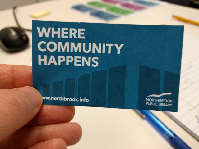 Redesigned library card
Our graphic designer worked through several iterations of the designs. There were two questions that kept nagging us though:
- Will people identify this as a Northbrook Public Library card?
- Will they be able to find it in their wallet?
Whose card is this?
It’s been my experience that answering questions about brand recognition in the context of a library can be difficult. On the one hand, we don’t have the marketing clout that large companies do. On the other, we tend to have really good market penetration in our communities. Plus we have natural monopolies! (Sort of. As a consortium member, our patrons tend to shop around for services.)
Our circulation manager also pointed out that we multiple iterations of our library card in circulation. People will often bring in a taped together card they’ve been using for many, many years. What patrons recognize as our library card may not be very consistent.
“I’m sorry that’s your insurance card”
I’m a firm believer that in most situations usability should take precedence over aesthetics. An earlier version of the card redesign had our tagline “Where community happens” in the lower left corner of the card. The logo was pinned in the lower right corner. It was completely minimalist and heavenly. (I had been looking at this site around the same time).
Someone pointed out that patrons might struggle to identify the card in a wallet when there was nothing on top. We already had issues with people misidentifying our library card with the current design. We learned from circulation staff that people often mistake their insurance card for their library card.
We mulled it over in the group, but it was clear this was something that needed to be tested with users. I have often found that questions about user behavior like this simply can’t be solved in a meeting room. You have to get out in the library and interact with real people.
Collecting feedback and testing
User testing does not have to be a complicated or drawn out process. In fact, I think it works best when you’re working fast and iteratively, checking assumptions, adjusting and moving on from there.
To run our test, we created a very short testing script with key issues we were addressing with the test and the tasks we would have the patrons perform.
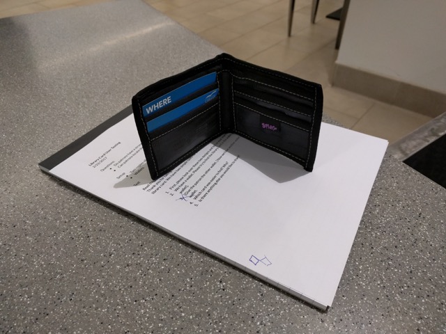 Our library card testing props
In this case, we designed the test to collect attitudinal and behavioral feedback. We presented two design options to the patrons and asked which one they preferred and why. Then we had wallets (a clutch style and a bi-fold style). We handed the wallet to the user and asked them which card was easier to find.
This was a simple, gut-check kind of test, but I liked that it involved something physical and tangible for the user to take, hold, look at, and experience. As we are working on modernizing our design language in the library, we are always looking for simple ways to incorporate this kind of behavioral feedback into the process.
Results
After 30 minutes of testing, we spoke to 9 patrons. We learned the following:
- Overwhelmingly, patrons preferred the architectural card design (A) over the plain card design (B)
- Patrons thought B was more bland.
- A few patrons made the connection that the two-toned design in A was architectural. One said it was unclear. The rest did not specify their feelings but still preferred A.
- Patrons generally did not find either card design easier to find than the other; both options were acceptable.
- Most patrons cited the blue hue as their main tool in finding the NPL card among other cards in their wallet.
- One patron commented that the different shades of blue made version A stand out more.
- Some patrons cited a slight preference for option A that has text in the upper left corner.
After a little bit of testing and patron feedback we felt more confident about option A and were ready to order new cards!