Librarian design challenge #1: Library card onboarding
Here is my entry in the first ever “librarian design challenge” to design a library card onboarding experience. It is a long one-page application that mimics many of the single-page “call-to-action” pages you see so many of these days.
What I came up tries to address the following the things:
- Why you might want a library card
- How to tell if you’re eligible
- What steps to take to get one
I tought it was important to imagine the process culminating in an automatically generated temporary number and triggering the creation of a physical card. Let’s see how I did.
Wireframe
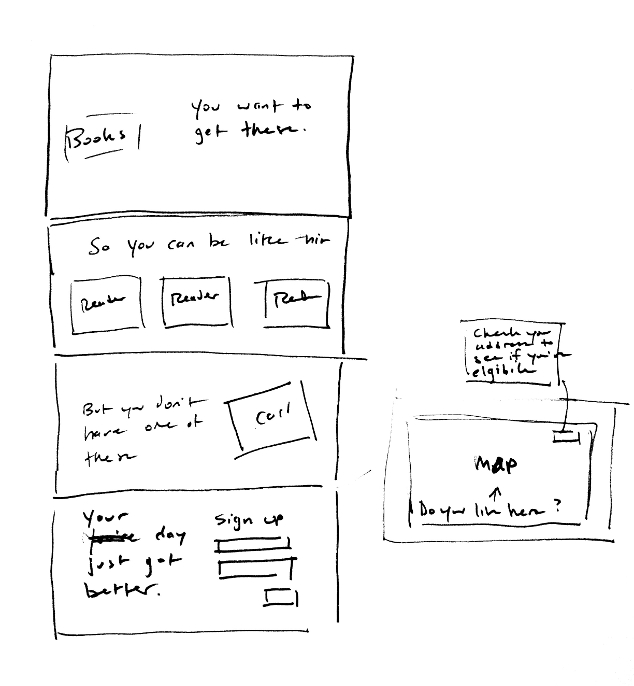
I thought I would start off by showing the simple wireframe that I created for the page. I used the bluntest of blunt instruments–a Sharpie and a piece of paper.
There are a few changes between this and the “final version” you’ll see below. You can see that I decided to add in the map component afterwards. So, a simple arrow accomplished that fact.
Making this wireframe was a good reminder for me that easy to produce, low-fidelity documents like this can be just as helpful as fancy clickable prototypes when you’re thinking through an idea.
Mockup
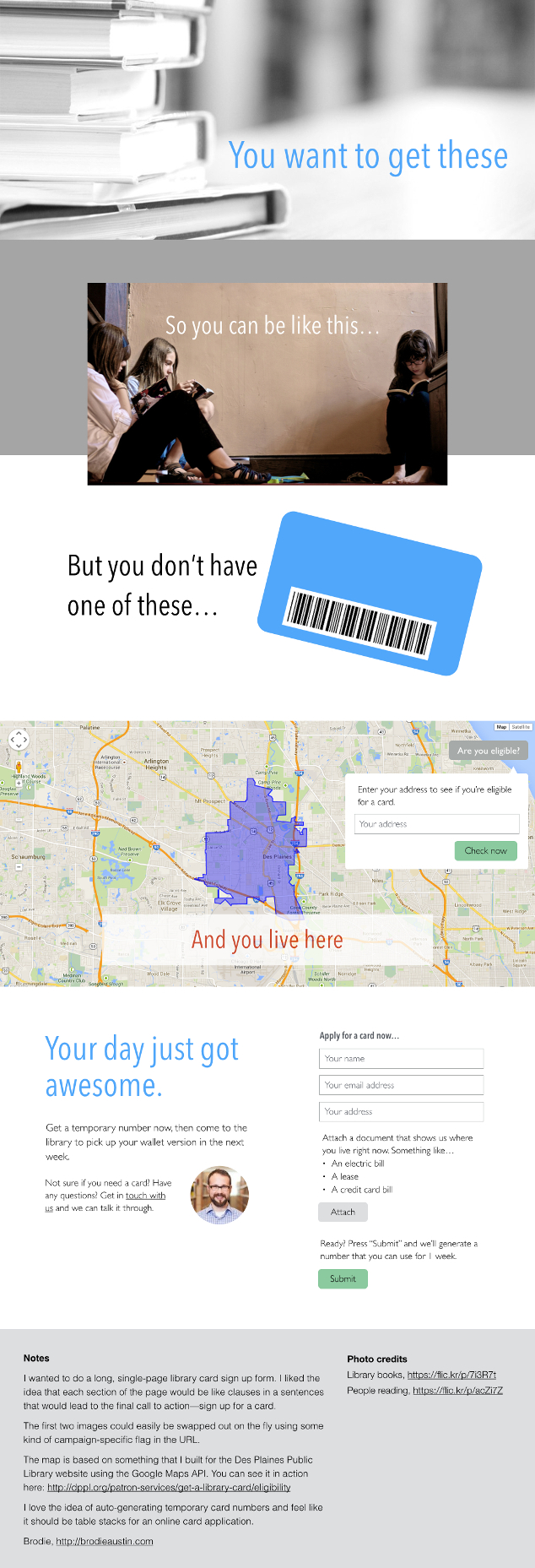
So, here is the mockup that I created from the wireframe. I decided not to build an actual HTML mockup and used Keynote instead. While I like “thinking in code”, it is also nice to have the freedom to move bits around on the screen with abandon.
As I made this mockup though, I tried to not to put anything too outlandish that couldn’t actually be created for a modern browser (or even a not-so-modern one).
A little self-evaluation
I was pretty pleased with what I came up with. It did end up being a bit more of a marketing page that I had originally intended, but I wanted to try to convey the “whys and wherefores” of signing up for a card in a pretty straightforward and conversational way.