Idea: Reading History Coffee Cup
I had a conversation with a coworker today about visualizing reading histories (or library checkouts, since we don’t really know if you read the stuff you check out) as an “end of the year” thing which set off a train of thought I’m trying to capture here, summed up in four words as “reading history coffee cups.”
One of the great (but sometimes scary) things about using Github to manage your coding projects is that it keeps tabs on when you’re making changes (or commits in the lingo). It’s pretty easy to get some nice graphs of how often and when you’re working. So you end up with visualizations of your work like these for my personal site:
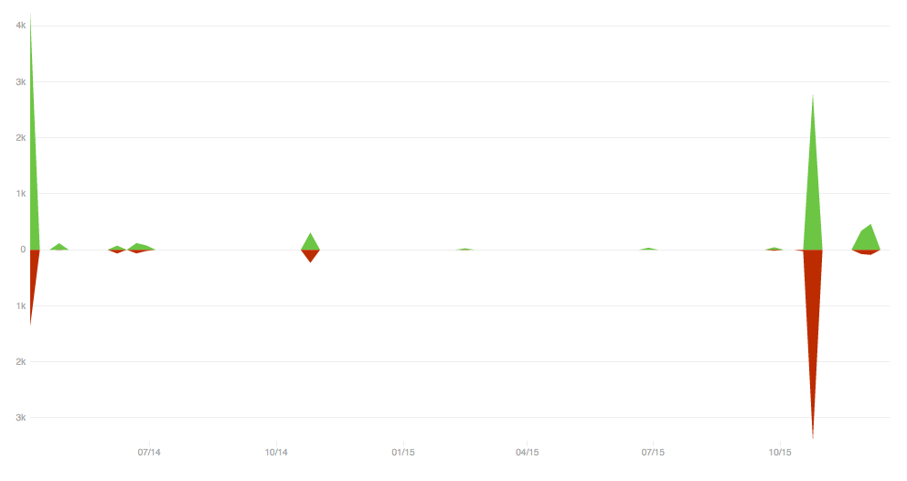 Commit frequency graph
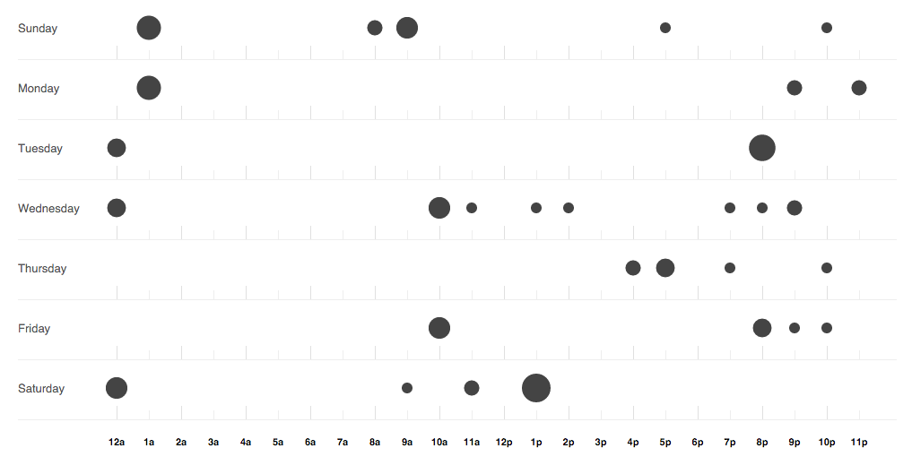 Punch card graph
They’re not exactly Nicholas Feltron level visualizations of the quantified self, but they’re nifty since they’re byproducts of something you’re already doing.
I found this tweet about someone having one of these Github charts printed on a personalized coffee cup appealing:
What a clever idea for a gift: @melissahsiung mapped her client’s @Github code commits over time. On a mug. Love it! pic.twitter.com/lR4HsjQ6pN
— Louis Rosenfeld (@louisrosenfeld) October 14, 2015and connected that to a discussion today with a coworker about ways to visualize and present to library users a year-end visualization of their reading history or library activity.
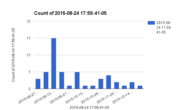
Later I went off to PGAdmin and the Sierra database to see what I could see. Currently we have about 3000 people signed up to save their reading history, which is an opt in feature of our catalog. I queried my own reading history and have about 50 entries (I only opted in recently).
I did a quick copy and paste and made this chart:
So, what would it take to allow patrons to make personalized reading history coffee mugs?
- Enter a barcode
- Look up patron ID in database
- Confirm that reading history is being recorded (and say sorry if it’s not)
- Retrieve reading history within certain date paremeters (each transaction in the table is timestamped)
- Aggregate the data into counts for each month
- Use a charting library like Google’s (which usually takes some nice JSON and gives you a chart) to generate the chart
- Either let the patron download the image (some customization options would be nice), or be fancy and try to integrate it with some kind of printing/coffee cup making service
So, that’s the basic idea. We’ll see what comes of it. The hardest part (not because it’s really hard, but because it would be nice to do it right) is interacting with the Sierra database. It would be nice to design a little API or wrapper to make getting and handling the data easier.