Sentences, lines, & high fidelity data
I attended one of Edward Tufte’s one-day seminars recently and wanted to jot down some thoughts about it. Very often, I latch on to slogans and came away with several slogans that are already working their way in to my daily conversation.
Sentences
I arrived late due to a total failure to use any kind of technology that makes modern life more convenient. So, I had to quickly orient myself to a close reading of a New York Times article. At first, I didn’t quite get the tone of the reading, and thought that ET was going after the Times for its over-reliance on experts and for communicating data in a way that obfuscated its meaning.
As I listening more closely though, I finally heard the point he was making: some data doesn’t need to be visualized. In fact, sentences convey data very effectively. You might even say that data conveyed in prose is information.
Some data doesn’t need to be visualized
Like any good close reading, ET was reading against the grain of the reader/listener’s expectations, as much as the text itself. In other words, I imagined him saying, “If you thought I was going to teach you to make pretty charts, then wake up!” This was a useful check for me, especially since I have not read his books cover to cover.
Lines
After the Times article, we turned to an epidemiological graph depicting the SARS outbreak from Beautiful Evidence. A graph like this is more than an illustration, it is an argument about causality.
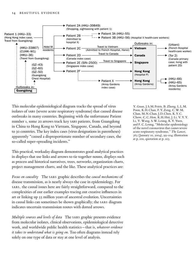
As ET said in the seminar, this graphic “shows the verbs.” And it does with very simple and minimalistic lines and arrows. The presentation of the graphic doesn’t detract or distract from its function: to help understand the outbreak of a disease.
Another effective example was an infographic from a NY Times story about corruption in politics. The graphic used bright red arrows to show how money had passeed hands between a whole host of unsavory characters.
The interesting thing about lines and these charts is that they are very flat. According to ET, verbs are flat, nouns are hierarchical. Lines that connect various and sometimes dispirate things show the complex connections in the real world. Lines that map a flat two dimensional space (however expansive that space might be) are more effecient that hierarchical trees that must be travesered in a more linear fashion.
High fidelity data
The last idea that really stood out for me during the seminar was the idea of high fidelity (or high density) data. ET reiterated the point many times throughout the day. He first mentioned “high resolution” data (as far my notes tell me) during a section about ESPN’s presentation of sports stats.
The examples that he gave were of web pages filled with columns and rows of numbers. Much like his point about sentences, ET argued that these densely packed screens of information were more effective because people could quickly digest and compare large amounts of data.
The big takeaway here was that we should always strive to offer “high resolution” presentations of data because these are more honest and ethnical presentations of information. We are less inclined or tempted to be misleading or dishonest when we are presenting more rather than less information to the user.
Principles of anatlyical design
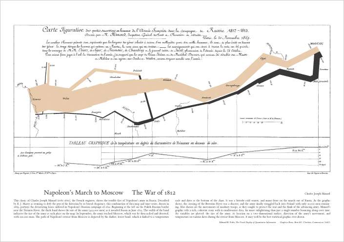
Since most of the one-day seminar deals with principles, I thought it would be fitting to wrap up by stating the “principles of analytical design” that accompany ET’s discussion of the famous graphic of Napoleon’s Russian campaign by Minard:
- Show comparisons, contrasts, differences
- Show causality or mechanisms
- Show multivariate data (3 or more factors)
- Completely integrate words, numbers, images, diagrams
- “Do whatever it takes”
- Provide documentation
- Content counts most of all
In the end, I think it’s the pragmatism behind “do whatever it takes” that I was my last and favorite takeaway. I expected to learn more about the “right way” to do present data and information, and instead came away with the idea that the only right way is the way that gets the job done effectively and honestly.